Introduction
Whole text books are written on data visualisation. I’ve not read much of any of them, but I’ve spent quite a bit of time thinking and experimenting with how satellite imagery derivatives such as NDVI are best visualised. There is no one size fits all. Basically the aim is to be able to extract as much information with as little effort and time as possible. As an agronomist, you are never just looking at one field but multiple fields and over the entire season and even comparing to past seasons. This article is to offer some ideas I’ve developed on the subject plus a few tips and gotchas along the way. It’s a bit opinionated and not a text book chapter.
What are we doing here?
There are a few ways to process and display satellite imagery such as natural or true colour, alternative band combinations, spectral indices (including vegetation indexes) and more. In this article I will focus on how spectral indices are visualised.
First, what is a spectral index? A spectral index is a formula designed to take individual bands as inputs and generate a derivative dataset intended to measure or depict a certain physical characteristic of the environment on the ground. For example NDVI takes in two bands – red and near infrared reflectance – into a formula that spits out a single layer where each pixel has a value of -1 to 1. Where, in a perfect world, dense, healthy vegetation would have a value close to 1 and zero vegetation ends up around 0 or a bit below. And then there is everything in between.
If we just had a map of paddock divided up in 10m-by-10m squares (as a grid) with a number representing the NDVI value in the square, it would be time consuming to analyse and it would be hard to grasp the overall trends across the paddock. This is where data visualisation comes in. We can take what is called a colour scale (aka colormap) that applies a colour to each square of the grid based on the NDVI value. There are lots of colour scales and lots of ways to drape the colour scale over the data.
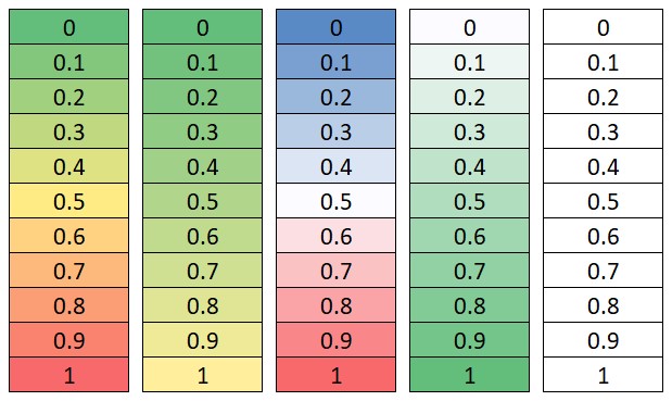
MS Excel Conditional Formatting applies color scales to cells the same way it is applied to vegeation index pixels
Ask these questions
The person interpreting the map should understand at least to some degree how the map published has applied colour to numerical values. More than once data has been misunderstood by a poorly applied colour scale or a user not understanding how to interpret it. Whenever looking at a spectral index visualisation consider asking yourself these questions:
- What is the minimum & maximum value in the dataset?
- What is the minimum & maximum value on the colour scale?
- Is the colour scale applied evenly across the dataset?
- Does the colour scale have enough colour changes in it to represent the variability in the data?
- Conversely, does the colour scale misrepresent the data with too many colour changes on a dataset with very tight range on the min & max?
- Will this colour scale transfer directly to other dates of paddocks you are comparing it to or is the min & max value of the colour change base on the statistics of the dataset?
- …there many other things but you get the idea – think this through.
Dynamic vs fixed
Question 6 above mentions the idea of transferring colour scales across datasets so they can be directly compared. I would call this a fixed colour scale. A fixed colour scale always has the same minimum and maximum. The obvious advantage to this is that you can directly compare different dates or fields side by side and the same colour will represent the same value across the board. In addition, the brain often trains itself that a colour means something and having that always change can mean it takes more time to interpret.
The dynamic colour scale is more traditionally seen where the minimum and maximum of the colour scale are set by the statistics in the dataset. For example, the bottom and top 2% of values are clipped or excluded from the dataset as these may be outliers. Then the min and max are identified and applied the colour scale. The advantage of a dynamic colour scale is you are almost always going to be able to extract more variability from the data if the min and max of the colour scale are squeezed together.
My preferred color scale
My favourite color scale is called Turbo. You can read about why it works well on their blog: Turbo, An Improved Rainbow Colormap for Visualization – Google AI Blog. As is, this is my go-to when applying a dynamic colour scale. When in need of a fixed colour scale I take the turbo colourmap and add a high contrast tip at either end i.e. Turbo Tips.
This is an attempt to get the best of both worlds:
- a fixed colour scale, so comparing different dates and paddocks is more logical,
- also being able to visualise the changes right through the growth cycle from none to high biomass with a high contrast set of colours.
This works well for detecting emerging crops at the bottom end and is a signal for saturation at the top end.
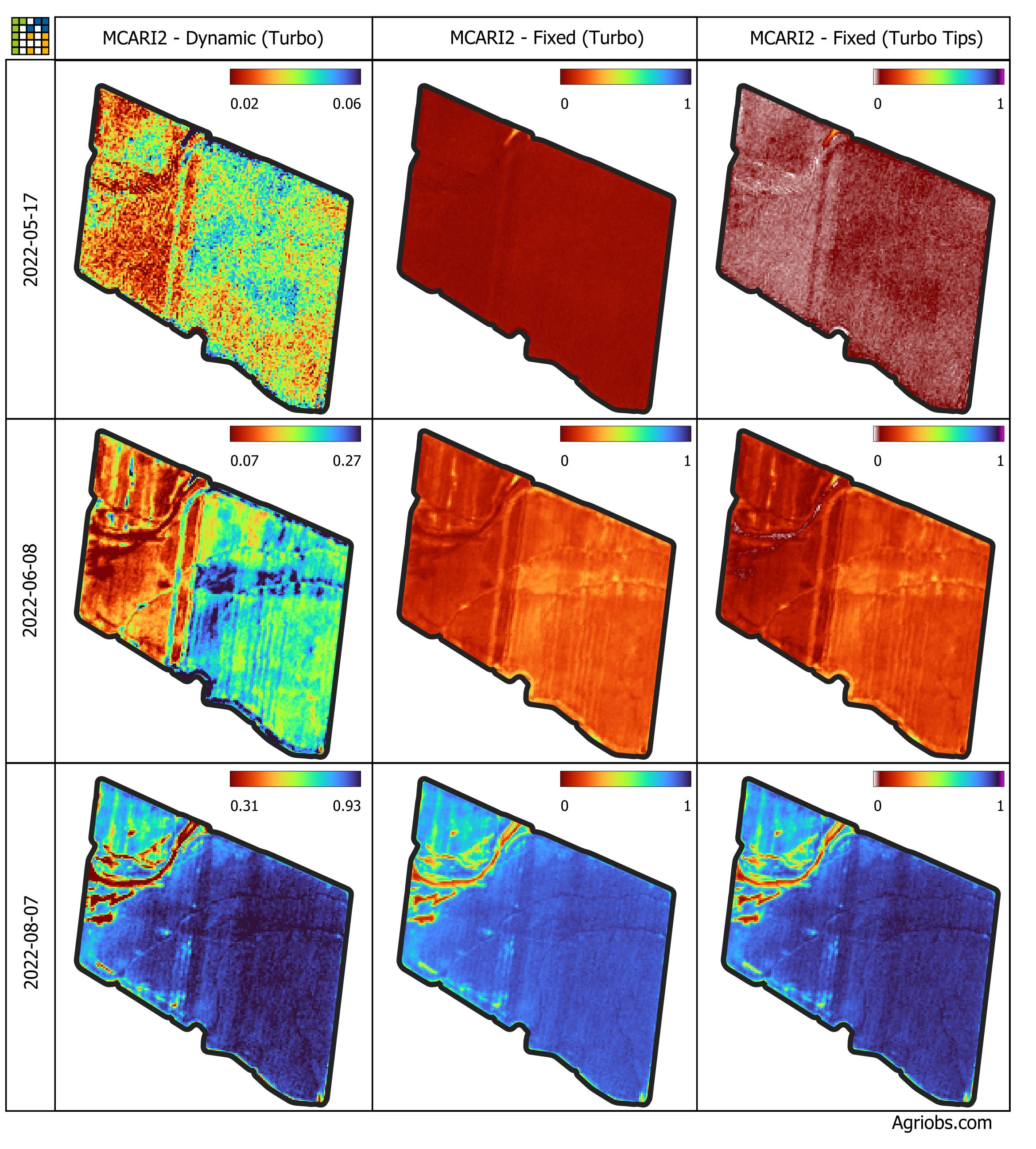
Visuals
These explanations are best understood visualized. Look closely at the color map legend in the Turbo Tips column.
The 17 May capture is probably the most interesting as the eastern side of the paddock is beginning to show signs of the wheat emerging.
Wheat paddock planted 9 May 2022. Three dates, with three ways to apply a color scale: dynamic, fixed and fixed with tips
As you can see form the histograms below, the data distribution is very diverse for these three datasets so it is a challenge to apply a single fixed colour scale to all three.
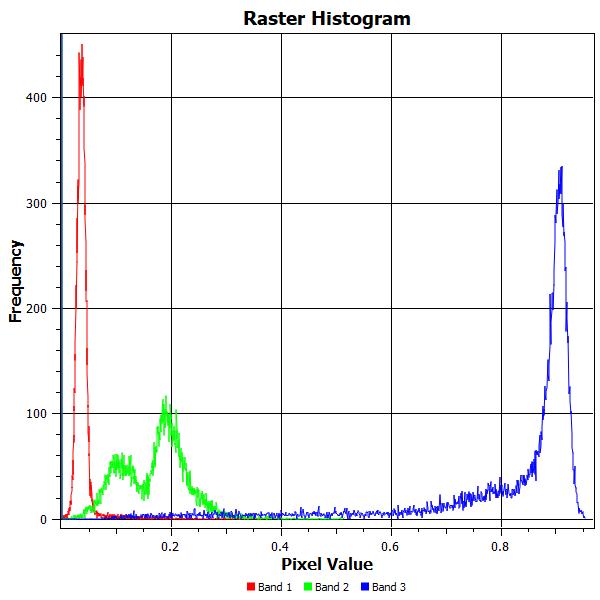
Histogram. Band 1: 2022-05-17, Band 2: 2022-06-08, Band 3: 2022-08-07
Fixed colour scale and data quality
A fixed color scale applied over a period of time is great for tracking progress and comparisons but this only works well with robust data. Thankfully, we now get good quality atmospherically corrected data for Landsat 8/9 and Sentinel 2. It’s safe (?) to take an image from 10 days ago and compare it directly to today. You can visually see or measure physical changes based on increases or decreases in the value of spectral index applied.
Unfortunately, this does not apply equally across all remotely sensed imagery. It’s important to understand if the timeseries imagery has been ground calibrated or processed to be analysis ready if necessary. Drone imagery and even aerial imagery can be particularly bad if left unchecked. Also, remember that there are different levels of processing from Landsat 8/9 and Sentinel 2. Obtain Level 2 to have a good chance at comparing satellite imagery through time.
Conclusion
There is a lot more to be said on this topic but the basic idea is you need to understand that data visualisation can be messy and opinionated. In saying that, as we move towards more imagery, more often, being able to visualise imagery in a way we can perceive what it is telling us quickly and accurately is very important.